In this article, we will explore the eCommerce conversion funnel and how to analyze and optimize it. The eCommerce conversion funnel is the journey a user takes on the e-commerce store from traffic to transaction.
What is the eCommerce conversion funnel?
The conversion journey of a user in marketing is described as a funnel as the initial stages of the user journey are the widest and this narrows down as we reach toward the bottom of the funnel where it’s the narrowest “conversion” stage of users.
Here are the stages of the eCommerce funnel:
- View products
- Add a product to the cart
- Add contact information
- Add shipping information
- Add payment information
- Complete the order and reach the order confirmation page
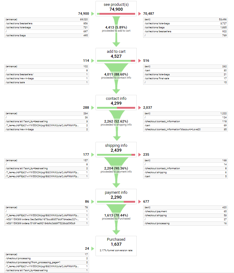
Here is how the funnel looks in Google Analytics under the ‘Funnel Visualization’ Report:
How to Measure Your Ecommerce Conversion Rate
The eCommerce conversion rate or your store’s conversion rate refers to the overall conversion rate of the complete funnel which means from traffic to transaction.
This can be calculated as the number of orders over the number of visitors.

You can read the complete post on eCommerce conversion rate here.
When you are looking to improve your store conversion rate, it’s important to look at each stage of the conversion funnel and design marketing experiments to improve each stage individually.
How to Use the eCommerce Conversion Funnel
We use the eCommerce conversion funnel to deep dive into the user journey and optimize each stage of the funnel.
Just looking at the overall conversion rate doesn’t help in finding problem areas in a specific stage of the funnel.
The first step is to make it measurable and the second step is to improve each stage of the funnel.
Remember: What can be measured can be improved.
For an overview of the funnel, we will split the complete funnel into 3 stages:
- The browsing stage
- The cart stage
- The checkout stage
And the checkout stage has multiple steps as described earlier in the article:
- Add contact information
- Add shipping information
- Add payment information
- Complete the order and reach the order confirmation page
Let’s look into the 3 stages below:
Stage 1: The Browsing Stage
This is the stage where the user is browsing our eCommerce products.
This can be through individual product pages, or collection pages, or even the home page.
This is why it’s good practice to add quick, direct add to cart buttons on the index pages like home, search, and collection pages so the user can quickly be taken through to the next stage of the funnel.
The main goal of any of these browsing pages is for the user to add to the cart.
There may be other secondary goals of the browsing stage such as:
- Sign up for our newsletter
- Add a product to the wishlist
- Create a user account
- Sign up for product stock notifications
However, none of these goals are directly going to move the user to the next stage of the funnel.
This is why it’s important to visualize the eCommerce funnel – it helps eCommerce entrepreneurs and marketers stay focused on what’s essential.
Don’t get me wrong – all of the above actions are great to have. But they have their own conversion funnels.
Our main focus here is getting the user to buy, for which the next step is to add to the cart.
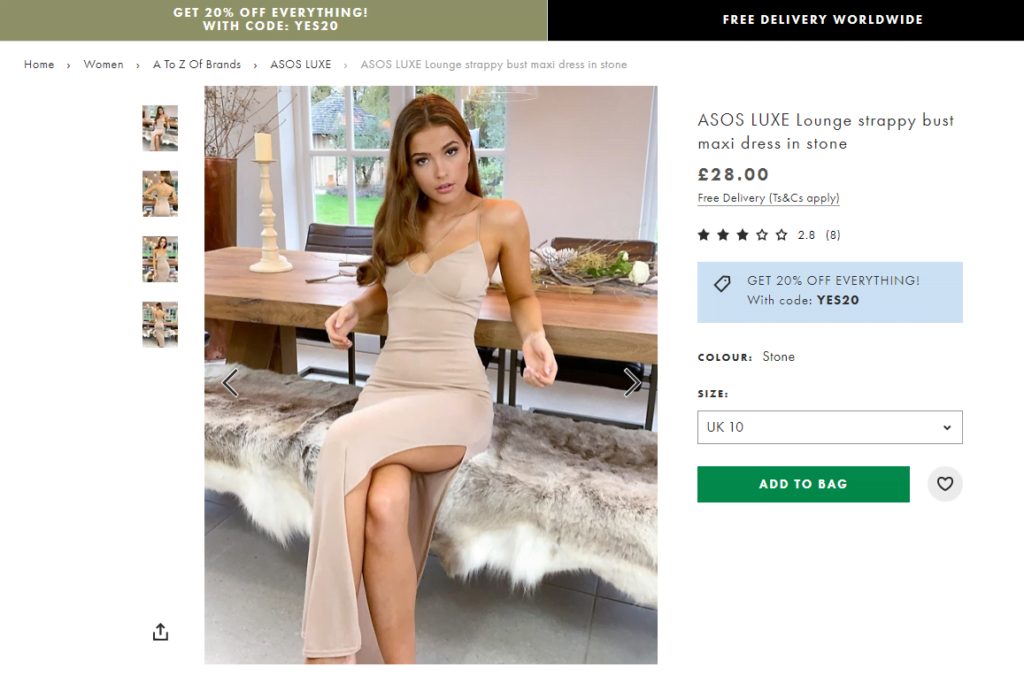
In the above example from ASOS, you can see a few elements that help move the user from browsing to the cart stage:
- The “get 20% off everything” message with the discount code mentioned on the product page itself.
- The green background ADD TO BAG button stands out on the page.
- The FREE DELIVERY message to encourage the purchase.
Stage 2: The Cart Stage
This is the stage when the user has already added at least one product to the cart.
The user may not be planning to checkout or browse more. It’s important to note that the user can jump back from one stage of the funnel to the previous ones anytime.
At some touchpoints, we don’t want the user to go back in the funnel but sometimes, we do.
For example, if the total cart value of a user is lower than our Average Order Value, we might want the user to go back to browsing from the cart stage by showing them a message like the below:

While this would take the user back to the browsing stage, it would be good for the overall order value.
In most other cases, our goal would be to take the user to the next stage as quickly as possible.
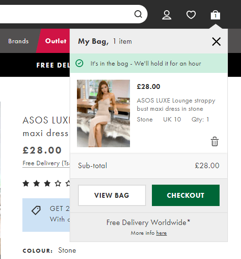
In the above screenshot, you can clearly see multiple elements that push the user to move from Cart stage to Checkout stage:
- The message at the top of the cart that says “It’s in the bag – We’ll hold it for an hour”
- The clear green background CHECKOUT button (it’s important to test the color and see which one converts the best in terms of click-through for your store)
- The Free Delivery Worldwide message
Stage 3: The Checkout Stage
The next and final stage of the user’s journey is the checkout stage.
Since this stage has multiple steps, it’s important to have a simple and compact design to showcase all the steps without much friction.
The important thing here is to showcase the steps involved in the checkout to the user and gamify their progress through the stage.
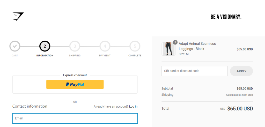
In the above example, you can see Gymshark’s checkout process on their e-commerce store, which they run on Shopify.
They have shown the 5 steps including the cart stage as already done (to encourage the user) while the next 3 steps are shown clearly so the user knows what to expects next.
As you have seen on the Google Analytics screenshot that each step in the checkout stage can be measured separately and that allows marketers to design experiments to improve each stage.
A marketing experiment could be as simple as reducing form fields or changing a button color or adding a countdown timer to checkout.
The key is to run experiments by changing one thing at a time and measuring the improvement in performance for the corresponding step in the funnel.
This is the growth marketing process we follow at Mapplinks for our eCommerce clients.
To learn more about how we can help you optimize your eCommerce funnel, feel free to write to rishabh@mapplinks.com.
All the best!