The eCommerce conversion rate is the most important metric you should be improving as a growth marketer or entrepreneur of any e-commerce store. Your entire growth funnel from getting the right traffic to generating sales will be improved if you focus on your conversion rate as your north star metric. The marketing hacks to improve your e-commerce conversion rate are often categorized as CRO or Conversion Rate Optimization.
So let’s get started.
3 Essentials of a Successful Ecommerce Store
- Driving the right traffic (or visitors)
- Having a good conversion rate
- Delivering a high-quality product with support
No matter which business you’re in, all successful online stores will have the above essential elements in place. The ‘right’ traffic refers to people who fit your target audience and are likely to convert. A ‘good’ conversion rate is what we’re going to focus on in this article.
What is the Ecommerce Conversion Rate?
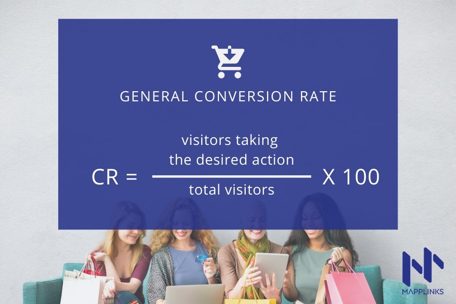
Your store’s conversion rate is the percentage of visitors on your website who make a purchase.
The conversion rate is the answer to the question: For every 100 people that land on my website, how many of them make a purchase?
You can easily check this number in Google Analytics or even in the basic reports on Shopify Analytics or WooCommerce reports or any other platform you use to run and manage your store.
How to Measure Your Online Store’s Conversion Rate
If 3 of every 100 people purchase from your website, then your online store’s conversion rate is 3%.

Make sure you consider a long enough timeline without major events (internal changes or external circumstances) to understand where you currently stand so you can then measure your improvement after using the growth hacks I’ll share in this post.
10 Other Conversion Rates to Measure for your Ecommerce Store
You can also measure conversion rates of other “desired” actions i.e. actions you’d like your website visitors to take on your online store.
Apart from purchase, this could be:
- Add a product to cart
- Add a product to wishlist
- Share a product on social media
- Sign up to your email newsletter
- Create an account on your store
- Install your store’s mobile app
- Create a gift card from their account
- Sign up to get updates about an Out of Stock product
- Sign up to your blog updates
- Sign up for discounts and offers
Hence, in the store formula, you can just replace the purchase field with the number of visitors taking the desired action you’re measuring and use the same formula to measure any of the above conversion rates.
Which is The Best Conversion Rate to Measure?
The “best” metric is the one that’s most important to you at the given stage of your business.
For example, if your sales happen mostly through your email campaigns and you need visitors to become email leads first before they usually make a purchase, then the conversion rate for email signups should be your focus metric.
If most of your sales happen through a few product pages, then conversion rates of those product pages should be your focus conversion rate metric.
In fact, individual product page conversion rate is one of my favorite metrics as it lets me A/B test growth experiments for specific product pages and if they work, I implement them for other product pages as well.
What is considered a Good Conversion Rate?
The final question we must answer before moving to the hacks is how much conversion rate is considered good?
While there’s no right or wrong answer for this, based on the clients I’ve worked with and the data I’ve analyzed, the following numbers should give you a fair idea of the ranges:
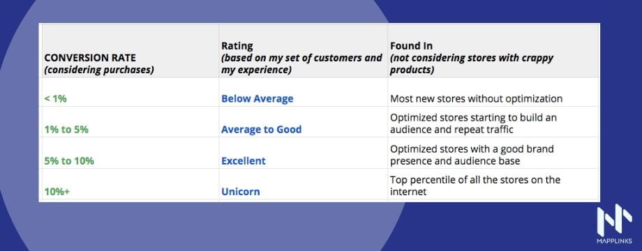
If you’re a new eCommerce store, get the basics right first. If you’re already in business for some time and have all the basic setup, you should aim to improve on the conversion rate 1% to 5% range as much as you can by using best practices and optimizations.
Once you hit 5% and beyond, then you’re probably going beyond the best practice and executing hacks and growth marketing experiments.
Now that you understand what eCommerce conversion rates are, which ones you can measure, which ones you should measure, and how to measure them, let’s get into the hacks, shall we?
Growth Hacks to Improve Your Conversion Rate
All the growth hacks I’m listing here I’ve experimented on while consulting multiple e-commerce businesses on their growth marketing process.
You’ll be able to implement these hacks on any e-commerce store however, I recommend Shopify as the platform for your eCommerce store and most of the implementations can be done through simple plugins, in-built options, or a line or two of code.
Built Trust and Improve Conversion Rate as a New store
The conversion rate hacks that work for huge brands may not work for a new store.
In this section, we will see the hacks that work extremely well for converting users to a new store.
Hack #1: Use Trust Badges & Safe Checkout Icons (Footer, Product page)
This is very useful if you’re in a new store. Adding trust badges on your website tells new users they can buy from you.
It’s more of a psychology hack than functionality but it’s quite effective. The best place to implement this is in your website footer and just below the checkout button on your products page.
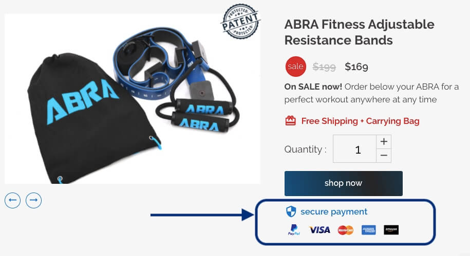
You can also choose the icons based on what your target audience will find the most trustworthy.
And make sure you actually integrate the payment options for which you’re adding the icons here.
Hack #2: Highlight safety and warranty (Homepage)
As a new store, you should be more flexible on returns, warranty, and ensure safety so users can make their first purchases with you.
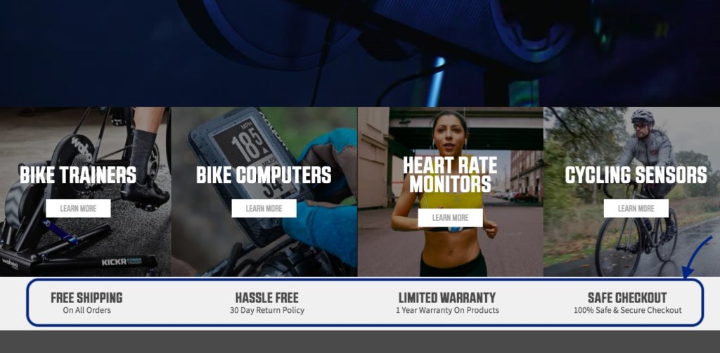
Once you’ve gained their trust, you can change these sections on the home page and showcase influencer testimonials and media releases instead.
At different stages of your brand-building journey, the trust elements you use in your UI will change.
Hack #3: Increase the return window
As a new store, you can get an edge above your competitors by increasing the return window. For example, if all your competitors are offering 30-day returns, you can offer a 60-day or even a 90-day return.
If your product is priced under $100 and you have a good margin, you can even ask the customer to keep the product and send them a new one to build the initial trust even stronger.
The long return window hack is also quite useful if you’re launching an innovative product that users aren’t sure about.
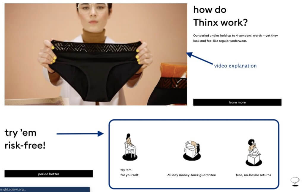
I have also highlighted in the screenshot the video explanation they’ve added on the home page. This is great for a new product.
Even as a new store without an innovative product, a video showcasing your products is a great conversion hack.
Here’s an example from a fashion eCommerce store:

You can also see how social proof elements in your titles and copy can be used.
Build Trust as a rising store and boost conversions
Hack #4: Use Media Features & PR showcase (Homepage)
If you’re a rising store gaining popularity, you can use your media collaborations or interviews and feature them on your home page.
A ‘perfect’ example of this is from PerfectKeto:

As a new brand, getting coverage from big media companies is a great push. However, even smaller magazines and indie bloggers can push your brand a long way.
Look for bloggers with cult followings, to begin with, and work your way to the top from there.
Hack #5: Use Influencer Reviews (Homepage and product pages)
As a store becoming popular, use the biggest influencers you have onboard and feature their reviews on the homepage as well as on relevant product pages.

You can replace these with brand ambassadors once we become a major brand. You can even convert your biggest influencers to brand ambassadors if you both can exchange enough mutual value from the deal and make a difference together.
Hack #6: Use Micro-Influencer Collaborations (Homepage and product pages)
Don’t worry if you’re still new and don’t have Joe Rogan onboard yet and you cannot boast a Joe Rogan collection on your eCommerce store.
Instead, you can run an outreach campaign to micro-influencers in your niche on Instagram and post their pictures with your products on your feed. This can be showcased on your eCommerce store as well.

You will also get the advantage of getting followers of the micro-influencers to know about your brand and store.
Here’s how you can convert micro-influencers into affiliates.
Convert first-time users to sales
Hack #7: Showcase the brand and offer a first purchase discount
Imagine you land on an eCommerce store for the first time. You need to:
- Get to know the brand quickly
- Remove friction to make your first purchase
To address the first, the best content type to engage first-time users is video, and to remove friction, the best way is to offer a one-time discount for their first purchase.
Here’s an example of both these in action on the same page:

Hack #8: Use an Exit-Intent popup with social proof
just when your store visitor is about to close the browser or move to the next social media feed from your store, you should give it the final push to give them one more reason to take action on your store – i.e. for making a purchase.
Usually, additional social proof is a great input here which will take them through the purchase.

This is called an Exit Intent (popup) as it pops up while the user moves their cursor to the top and is about to close the browser tab.
For mobile devices, you can also set a time when the exit popup should appear. There are many Shopify plugins for an exit popup and you can also get it custom coded by your tech or web team/developer.
Hack #9: Offer Payment in Installments (Product page)
If a user finds a product expensive or if they cannot afford it at the moment, but still want it, they will leave your store, thus affecting your eCommerce conversion rate.
But guess what?
You can convert most of these people easily by offering payment in installments.

In the above screenshot, I have shown a good example of installments as well as creating urgency using the low stock left notification message on the page page.
Hack #10: No hidden prices during checkout (Product page)
Make sure you mention all the prices on the product page. Sometimes, you might have a high add-to-cart rate (conversion from product page to cart page or from product detail to cart %) and then see many exits on your Analytics.
There could be many reasons for this but it’s usually because you added an additional charge during the checkout process.

Now that we spoke about different conversion rates, you should also start tracking them separately once you go a little more advanced on your eCommerce CRO efforts.
The idea is to find all the touch-points before a visitor makes a purchase and track all their conversion rates separately.
CRO for Returning Users
Here are some special hacks for converting returning users. And of course, all the other hacks you have been learning will also help improve the returning users’ conversion rates.
These are the hacks I specifically wanted to mention as CRO for returning users.
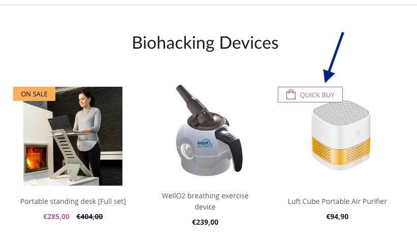
Hack #11: Save user’s time with a Quick Buy button (Collections page, Home page)
80% of the time, you don’t need to take the users to a cart page. This is true especially if your average order has 1 item only.
That means there are a lot of steps in your checkout process that can be eliminated, especially for returning users.
A Quick Buy button usually opens the product information within the home or collections page rather than going on the product page. You can then select the quantity of the product and directly proceed to checkout.
Hack #12: Showcase discounts for special days
On special days, search volumes are higher for specific keywords, people respond better to ads, and will open your emails if they’re looking for a gift for someone special or just a discount!

Use these days to make your website showcase the offers for the special days. This will improve conversion rates on special days – and marketers have created many special days throughout the year!
So it will increase your average conversion rate as an overall metric.
Conversion Rate Optimisation Hacks for the Product Page
Now, we will discuss CRO methods by page. Every store a similar foundation with the home page, about page, collections page (or category page), product listing page, cart page, and the checkout process.
The checkout process may have multiple touchpoints based on the tech stack you’re using for your eCommerce store. Since I always recommend using Shopify, we will stick with the checkout process of a regular Shopify store.
Let’s start with the product page as most of your traffic will land on one of your product pages from your campaigns.
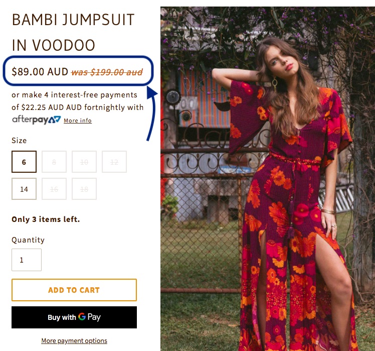
Hack #13: Show a higher old price (Product page)
Even if your product is not on sale, you can show a higher price than the old price and show the current price as the lower price.
This is a psychological growth hack as people like they think they’re getting a deal which increases their chances of making the purchase.
Hack #14: Don’t make users search for size charts (Product page)
This one is for eCommerce products that come in different size variations. For example, if you’re a fashion label, most users will want to map your product sizes to their individual dimensions.
Rather than hiding the size chart option, show the dimensions as soon as the user clicks on their size.

Hack #15: Add an option to signup for Out Of Stock Products (Product page)
If a customer is interested in a product that is out of stock, they would usually see it’s out of stock and leave your website.
Well, unless you have a way to convert them or rather ‘book the conversion’ for the future.
The best way to do this is to add an ‘Email when available’ option where the visitors can leave their email ID (note this is also counted as a conversion!) and you can notify them when the product is back in stock on your store.

Hack #16: Provide a payment option visitors know (Product page)
I personally don’t like to enter my credit card information on all websites – especially if I’m a first-time user on an eCommerce store.
Always provide a trusted payment option users are already familiar with.

You can adjust this to match the user’s preferred payment gateway so it’s a dynamic button. This is an in-built feature on Shopify.
Conversion Rate Optimization for the Collections Page
Now, let’s discuss some conversion hacks for the collections page.
This can also be called a category page or any page where multiple products show up together.
Hack #17: Improve CTR to Products using the Price Comparison hack (Collections page)
Similar to Hack #10, you can also use a price comparison psychology hack on your collections, categories, search pages (what we call the archive pages)
Here’s an example:

Here’s another example:

Improve Conversions by Optimizing Your About Page
Often overlooked by e-commerce marketers, the about page is a great way to use psychology and copywriting to improve overall store conversion rates.
In this section, we will explore some CRO hacks focused specifically on the about page.
Hack #18: Showcase your mission to appeal to your right audience (About pages)
If your brand follows a certain way of life or principles that appeal to a special target audience, make sure you highlight the message on your store’s home and about pages.
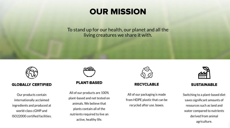
I’ve also seen some brands include a sleek row of their beliefs and mission on all pages of their online store.
This improves Conversion Rates by adding to the appeal with the right target audience.
CRO Hacks for the Cart Page
Hack #19: Show “Earned free shipping” with a progress bar
Once the users have entered the minimum value of products required to get free shipping, tell them they’ve earned it.
When you’ve earned something, it’s hard to lose it. Hence, users will be more likely to complete the purchase.
Depending on your brand’s voice, you might also want to include an emoji here. Here’s a reference from a mobile version of this hack’s preview:

I wish you all the best with your eCommerce CRO experiments!
