Where should you place your CTA buttons? In this article, we will use the Gutenberg Principle to answer this golden question.
The placement of CTA (call-to-action) buttons on a page can make or break user engagement. If you’re aiming to maximize clicks, conversions, and user satisfaction, it’s essential to understand the science behind where users naturally look and interact.
This is where the Gutenberg Principle—a foundational layout principle used by designers to guide user attention—becomes invaluable.

What is The Gutenberg Principle?
The Gutenberg Principle, often applied to design and UX, helps predict the natural movement of users’ eyes across a page. Named after Johannes Gutenberg, the inventor of the printing press, this principle originally applied to printed pages, but it holds equally true in the digital age.
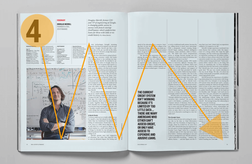
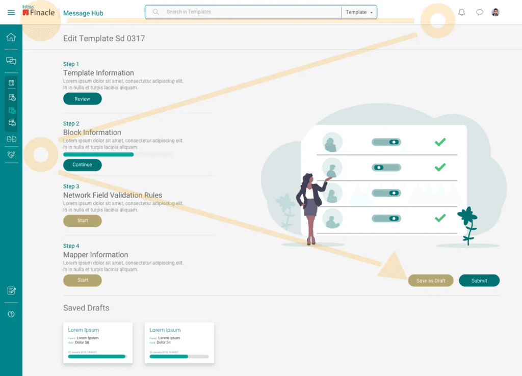
The core idea is that users’ eyes naturally start in the top left of a page and move across diagonally to the bottom right in a “Z” or “F” pattern, depending on content density and page layout.
This movement splits a page into four zones:

How to Apply the Gutenberg Principle to CRO (Conversion Rate Optimisation)
Primary Optical Area (Top Left):
This is where users’ eyes naturally land first. It’s an ideal area for eye-catching elements but not the strongest spot for actionable items.
Best for Attention-Grabbing Elements: Since this is the first place a user’s eyes will go, it’s a good spot for eye-catching headlines, a product image, or an introductory sentence. However, CTAs here may not get as high a conversion rate since they don’t align with users’ natural progression through the page.
Strong Fallow Area (Top Right):
After the first glance, eyes move toward the top right. This spot can be powerful for branding or a secondary CTA.
Ideal for Supporting CTAs: The top right is often used to place secondary CTAs or branding elements. This zone is great for elements like “Learn More” buttons or links to supplementary pages, as it allows for engagement without disrupting the user flow.
Weak Fallow Area (Bottom Left):
The lower left sees less attention and is generally less effective for CTAs, but it can be used for supplementary information.
Low Priority for CTAs: The bottom left tends to receive less attention as users’ eyes skip toward the right. This area can be used for supplementary information, testimonials, or trust signals that add credibility but don’t require immediate action.
Terminal Area (Bottom Right):
The endpoint of eye movement, this area is typically where users’ eyes settle. For digital design, this is often the best location for placing primary CTAs, as users are naturally inclined to take action here.
Primary CTA Placement: The bottom right is where users’ eyes settle after scanning the page. Placing a CTA here aligns with the natural eye movement, making it an ideal spot for conversion-focused CTAs, like “Get Started,” “Buy Now,” or “Sign Up.”

A/B Testing Your CTA Button Placement
While the Gutenberg Principle offers an evidence-based guideline for CTA placement, every audience and website is unique. This is where A/B testing comes in, allowing you to refine CTA placements and validate assumptions with real user data. Here’s a step-by-step approach to A/B testing CTA button placement using the Gutenberg Principle:
- Choose Zones to Test:
- Test placing the CTA in the Terminal Area (Bottom Right) as your primary location, comparing it to the Top Right (Strong Fallow Area) for a secondary CTA or alternative version.
- You could also experiment with placing CTAs in the Primary Optical Area (Top Left) to see if early exposure increases click-through rates, especially for longer landing pages.
- Set Up Your Test Parameters:
- Define Success Metrics: Typical metrics to track include click-through rate (CTR), conversion rate, and engagement time (how long users spend interacting with the page).
- Establish a Testing Window: Running the test for at least two weeks ensures you have enough data to draw meaningful conclusions.
- Using Heatmaps and Analytics Tools:
- Heatmaps: Heatmaps track where users interact on a page, providing valuable visual insights into which areas attract the most attention. Use a tool like Hotjar or Crazy Egg to see how users engage with your CTAs across different placements.
- Scroll Maps and Click Maps: These tools show how far users scroll down the page and where they tend to click. For pages with multiple CTAs, scroll maps can help determine whether users are seeing and clicking on CTAs in the Terminal Area.
- Analyze and Implement Insights:
- After gathering data, compare the performance of each CTA placement. Look for patterns such as a higher CTR in the Terminal Area but increased engagement with CTAs in the Strong Fallow Area.
- If one placement significantly outperforms others, consider making it the default placement across similar pages. For additional refinement, you can test other factors such as button color, text, and size while keeping the placement constant.
Case Studies and Examples

To illustrate how the Gutenberg Principle can enhance CRO and CTA placement, let’s look at a few examples:
- E-commerce Landing Page:
- A popular e-commerce site experimented with moving its “Add to Cart” button from the bottom center to the bottom right (Terminal Area) of the page. After testing, they found that the Terminal Area CTA increased conversions by 20%, as it aligned with users’ natural reading and browsing patterns.
- Content Marketing Blog Post:
- A blog focused on content marketing tried placing a “Download Free Guide” button in the Top Right (Strong Fallow Area) as a secondary CTA. By doing so, they achieved a 15% higher download rate, as readers who were not ready to commit on the first read-through had a clear option after skimming the page.
- SaaS Signup Page:
- A SaaS platform initially placed their “Start Free Trial” button in the Primary Optical Area (Top Left). After running a test, they found the Bottom Right was more effective, leading to a 25% increase in signups by following the natural flow of user attention.
Practical Tips for Implementing the Gutenberg Principle in Your Design

To make the most of the Gutenberg Principle and maximize your CTA performance, here are some actionable tips:
- Balance Visual Hierarchy with CTA Placement: Use a consistent visual hierarchy where headlines and primary visuals draw the eye first. After the initial attraction, place CTAs strategically within the Terminal or Strong Fallow Areas.
- Test Multiple Button Formats: Vary button sizes, shapes, and styles while keeping the position fixed in the Terminal or Strong Fallow Area. This lets you refine the aesthetic impact of the button without disrupting the natural eye flow.
- Use Visual Cues: Directional cues (like arrows or images of people facing the CTA) can subtly guide users’ attention to buttons placed in the Terminal Area, making the CTA more noticeable.
The Terminal Area and Strong Fallow Area often prove to be the most effective zones for CTAs, but A/B testing is crucial to validate these placements and adapt to your unique audience. Remember, while principles like Gutenberg offer valuable guidance, user testing and data ultimately drive the most effective design decisions.
Practical Implementation of the Gutenberg Principle: Tips and Best Practices
- Use Contrasting Colors:
- A strong, contrasting color for your CTA button helps it stand out, especially in the Terminal Area. Users scanning the page will naturally notice the CTA even more if it visually contrasts with surrounding elements, making it easy for users to find when they’re ready to take action.
- Optimize CTA Text:
- Use action-oriented and specific language for CTA buttons, such as “Get Started Now,” “Claim Your Free Trial,” or “Add to Cart.” Generic phrases like “Submit” or “Click Here” are less effective. Crafting clear, benefit-focused language increases the likelihood of engagement and conversions.
- Incorporate Visual Cues:
- Guide users’ attention with subtle directional cues like arrows, images, or icons pointing toward your CTA. For instance, a testimonial box or product image angled toward the Terminal Area can subtly guide users to the CTA, increasing the chance of interaction.
- Place Secondary CTAs in the Strong Fallow Area:
- Secondary CTAs are valuable for providing options without detracting from the main CTA. For example, on a product page, you might place “Learn More” or “View Other Options” in the Strong Fallow Area, while keeping the “Buy Now” button in the Terminal Area. This approach engages users who may want more information before committing.
- Experiment with Button Size and Shape:
- Button size and shape affect the perception of a CTA’s importance. A larger button in the Terminal Area can make it the most visually commanding element on the page, subtly encouraging action. A/B test different sizes and shapes to see what drives the highest engagement.
Final Tip: Remember, the goal isn’t only to place CTAs strategically but also to ensure that every page element contributes to a cohesive and engaging experience. With the right approach, your CTAs will do more than drive clicks—they’ll help build a user experience that feels effortless, intuitive, and impactful.


